Logo of MicroWiki
 | |
| Owned by | MicroWiki Foundation |
|---|---|
| Created by | Andrew |
| Created on | Adobe Illustrator |
| Introduced | 21 May 2022[1] |
| Website | MicroWiki |
The logo of the online micronational encyclopaedia and wiki MicroWiki is a magnifying glass over two land masses, with the wiki's name underneath it—the wordmark. The colour is MicroWiki blue (similar to dark teal), although a white variant of the logo is also used. The logo appears at the top left corner of the wiki on desktop mode, and a black variant without the wordmark is also used on the main page; it is also used on Czech MicroWiki, MicroWiki's Czech-language edition, and MicroWiki@Discord. The font for the wordmark is Montserrat (Medium 500), a public domain font. Adopted on 21 May 2022, MicroWiki has had four previous logos since its foundation on 27 May 2005, with the first being adopted around December 2007.
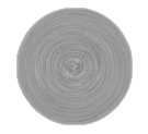
Although MicroWiki was founded on 27 May 2005, MicroWiki's first logo was only adopted by at least December 2007—a grey circular spiral. After moving to an independent domain on 7 November 2010, MicroWiki adopted its second logo—a 2D globe of the Earth with the flags of several micronations atop the wiki's eponymous wordmark, accompanied by the motto "The micronational encyclopædia". A third logo was in place between 28 November 2013 to 15 April 2015, which consisted of a more simplified globe made up of two colours—blue and green—with the new motto "The Micronation.org Wiki". It was replaced by the second logo. A fourth logo was in use between 23 March 2017 to 21 May 2022, which was a 2D hallow globe symbol with meridians and parallels, with the eponymous wordmark in all lowercase and no motto. It was solely dark blue, and taken from the logo of the World Bank.
The logo is trademarked in the United Kingdom, where it was designed. Additionally, the MicroWiki administration intends to formally register it as a trademark of the MicroWiki Foundation.
Present logo


The official logo of MicroWiki consists of a right-leaning magnifying glass over two land masses—situated at the top right and bottom left—with the wiki's name underneath it. The font for the wordmark is Montserrat (with the size Medium 500, hence its bold look), which is a public domain font. Tilted, the handle of the magnifying glass extends towards the letters "ik".[1] The colour for the entire logo is called MicroWiki blue, which—in hex code—is #1D3C72[3] (RGB: 30,59,115), which is similar to the colour biscay (#2f3c53; RGB: 47,60,83). Adopted on 21 May 2022, the logo symbolises the fact that micronations are often small. The logo is copyrighted in the United Kingdom, where it was designed. Additionally, the MicroWiki administration intends to register it as a trademark of the MicroWiki Foundation.
| MicroWiki Blue | |
|---|---|
| 8-bit hex | #1D3C72 |
| RGB | 29, 60, 114 |
| CIELAB | 25.36%, 3.324%, -28.182% |
| HSL | 218.118°, 59%, 28% |
| Similar colours | |
| MicroWiki Blue (for comparison) | |
| PANTONE 534 C[4] | |
| Biscay | |
History
Due to the fourth logo having been taken from the World Bank, there had been several proposals from users of the wiki to change it,[5] however none gained fruition. In January 2022, the MicroWiki administration came to the agreement that, given the new year, there should be a look into rejuvenating the wiki, with a new logo being "just the first step in refreshing MicroWiki's brand". Beginning on 22 March, several conceptual drafts were made by Andrew. A new motto, "the free micronational encyclopaedia", was also considered. Initially, the administration wished to change the primary colour associated with MicroWiki and the colour of its new logo at the same time, which would be in line with their efforts to rebrand the wiki. Proposed colours were purple and velvet, as shades of purple have historically been associated with royalty, a common government type among micronations. However, in the end the administration decided to keep the logo and site blue as they felt that completely rebranding the colours of the wiki at once would be too radical of a change. Additionally, they also disliked the proposed colours. Andrew used Adobe Illustrator to create the logo. Between 11–13 August 2023, merchandise bearing the MicroWiki logo was presented at MicroCon 2023 in Ypres, Belgium.
Previous logos
Although MicroWiki was founded on 27 May 2005, MicroWiki's first logo was only adopted by at least December 2007—a grey circular spiral. Its meaning and uploader is unknown.
Second logo
The second logo was first in use between 17 November 2010 and 28 November 2013, and again between 15 April 2015[6] and 23 March 2017.[7] When MicroWiki moved to a domain independent from Wikia on 7 November 2010, the users of the wiki saw it fit to adopt a new logo. The logo was eventually adopted on 17 November. The logo is a 2D globe of the Earth—drawn in an artistic style and with all land masses (including Antarctica) coloured green—centred around Africa. The globe is surrounded by a blue border which has sixteen micronational flags equally surrounding the it. Below the globe is the wiki's eponymous wordmark, which is atop the motto "The micronational encyclopædia". The flags represented, from top-centre clockwise, are: the Principality of Sealand, an unidentified micronation, Aerican Empire, Nemkhav Federation, Federal Republic of St.Charlie, State of Sandus, Empire of Austenasia, Community of Landashir, Federation of Egtavia, Grand Duchy of Flandrensis, Kingdom of Lovely, Federated Republics of A1, Republic of Molossia, Kingdom of Wyvern, Free State of Renasia and the Principality of Hutt River. It may have been designed by Petya d'Égtavie.
Third logo
The third logo was in use between 28 November 2013[8] and 15 April 2015.[6] The logo is a simplified globe of the Earth centred around the Atlantic Ocean, with the land masses coloured blue and the ocean coloured green. Below the globe is the wiki's eponymous wordmark, which is atop the motto—in italic text—"The Micronation.org Wiki". Both the text and motto are blue. The two colours used are:[8]
| Colour code | ||
|---|---|---|
| 8-bit hex | #264f65 | #699e75 |
| RGB | 38,79,101 | 105,158,117 |
| CIELAB | 31, -9, -18 | 61, -25, 16 |
| HSL | 201°, 62%, 27% | 134°, 34%, 52% |
Fourth logo
The fourth logo was in use between 23 March 2017[7] and 21 May 2022. It is a hallow 2D globe (circle) with meridians and parallels, with the eponymous wordmark in all lowercase and no motto. Solely dark blue, it remains the simplest logo in MicroWiki's history. Designed by Anthony Clark, it was taken directly from the logo of the World Bank, a fact which frequently received criticism from users of the wiki.[9] It was also frequently noted to resemble the stylised globe with meridians emoji (🌐), sometimes jocularly nicknamed the "MicroWiki emoji".[10] The colour of the logo is:[11]
| Colour code | |
|---|---|
| 8-bit hex | #083484 |
| RGB | 5,52,132 |
| CIELAB | 23, 13, -49 |
| HSL | 218°, 88%, 27% |
Usage
The logo appears at the top left corner of the wiki on desktop mode, and a black variant without the wordmark is also used on the main page; it is also used on Czech MicroWiki, MicroWiki's Czech-language edition, and MicroWiki@Discord. This had also been the case with MicroWiki's previous logos. A header featuring the fourth logo was used on the main page between 7 August 2019 and 13 January 2021. Historically, the logo for the wiki had also been incorporated into the logo of the MicroWiki forums. The first such logo was in 2012, when the globe from MicroWiki's second logo was used to replace the 'o' in "MicroWiki". The globe was aligned to the centre, with the text "Forums" at the bottom right of "MicroWiki". When MicroWiki adopted its third logo on 28 November 2013, the logo of the forums was changed accordingly—though the new globe remained in place of the first 'o', the new wordmark was straight in its entirety, and the forums changed its name and thus wordmark to "Micronation.org Forum". When the wiki's fourth logo was adopted on 23 March 2017, the forums changed its logo once again—the globe of the wiki was this time at the left side of the new wordmark (in all lowercase) "micronations.wiki | forum". As the MicroWiki forums were deleted on 9 January 2021, it did not see MicroWiki's fifth and current logo.
Alternative and commemorative logos
-
BoratWiki, April Fools' Day 2012
-
MichaelWiki, April Fools' Day 2017
Second logo
-
A variant created on 15 March 2015
Fourth logo
-
Globe without wordmark
-
Halloween logo
-
Christmas logo
-
April Fools' Day, 2020
-
Header on the main page (7 August 2019–13 January 2021)
See also
References
- ↑ 1.0 1.1 Andrew [DeercWerdna#2182] (21 May 2022). "@everyone Take a look at our brand new logo, made exclusively for MicroWiki. [new line] We decided to move away from the "globe" logo as it didn't really represent MicroWiki, nor micronationalism, and is more associated with the World Bank. This logo, a magnifying glass over the world, we feel is a much better representation of MicroWiki and micronationalism as a whole. [image attached]" (message). Edited. MicroWiki@Discord: discord.gg/6eKYber8JY. Channel: #announcements. Retrieved 4 June 2022.
- ↑ @MicroWiki at Twitter. Retrieved 4 June 2022.
- ↑ MicroWiki:Branding guidelines. MicroWiki Foundation. Retrieved 9 June 2023.
- ↑ PANTONE 534 C. Pantone. Retrieved 9 June 2023.
- ↑ Lycon, Jayden (3 April 2021). "A new identity for MicroWiki: a proposal". Curio Publications – via Issuu. Retrieved 4 June 2022.
- ↑ 6.0 6.1 Revision 09:53, 15 April 2015 (image). File:MWlogo.png at MicroWiki. "Reverted to version as of 18:47, 9 November 2013". Retrieved 4 June 2022.
- ↑ 7.0 7.1 Revision 19:34, 23 March 2017 (image). File:MWlogo.png at MicroWiki. Retrieved 4 June 2022.
- ↑ 8.0 8.1 Revision 17:18, 28 November 2013 (image). File:MWlogo.png at MicroWiki. Retrieved 4 June 2022.
- ↑ Lycon, Jayden [u/kazoosportacus] (3 April 2021). "My proposal for a new logo for MicroWiki" (post) – via Reddit. Archived from the original on 4 June 2022.
- ↑ 🌐 at Microtionary. Institute of Micropatriological Research. Retrieved 1 August 2023.
- ↑ Revision 22:04, 9 March 2018 (image). File:MWlogo.png at MicroWiki. Retrieved 4 June 2022.
External links
- Logo of MicroWiki (file) at MicroWiki
- Logo of MicroWiki at Wikimedia Commons
